Visualizing multiple percentages as polygons: React Native polygon chart

In this article, I will introduce my newly developed npm package to visualize multiple percentages as polygons. You can get more information from GitHub repo under DIGIEGGS organization.

What are these components expected to achieve?

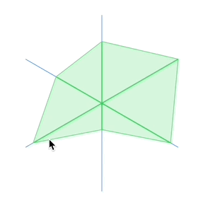
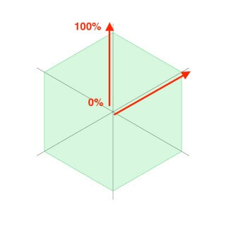
You may have seen a presentation similar to our chart before, but for those who haven’t seen it yet, let’s explain the working principle.

As you can guess from the name, every component in this package represents a different polygon type. I named the diagonal lines in polygons as “poles”. Each of our polygons have same number of poles as the sides. As going along a pole from center of the polygon to its edge, the value represented by the pole increases.

As you can guess from the name, every component in this package represents a different polygon type. I named the diagonal lines in polygons as “poles”. Each of our polygons have same number of poles as the sides. As going along a pole from center of the polygon to its edge, the value represented by the pole increases.

Let’s get started!

First, let me guide you to create a clean React Native app with typescript template. If you are familiar with setting up React Native environment from scratch, you can skip the first step.

Note: Unfortunately this component is not supported for Expo for now.

1. Creating a React Native app with typescript template

  • Open a terminal window
  • Navigate to directory you want to create your project at
  • Copy & paste the command below:

npx react-native init PolygonChartTest --template react-native-template-typescript

2. Installing the package
As I mention my previous article, you can use different terminals as you wish as long as you are being careful about your terminal is on your project’s root direction.

Let’s run the following commands in order:
npm install react-native-svg @digieggs/rn-polygon-chart
cd ios && pod install && cd ..

Now we can run our application with following command:
npx react-native run-ios

Creating our first polygon chart

We have four different polygons in our package: Triangle, Tetragon, Pentagon and Hexagon. I will use the Hexagon to show you more poles in this article.

We can delete all the code in our App.tsx file and start coding!

  • First, add the necessary imports:

import React from "react";
import { SafeAreaView } from "react-native";
import { Hexagon } from "@digieggs/rn-polygon-chart";

  • Then, create the functional component and export it

const App = () => (
<SafeAreaView>
<Hexagon />
</SafeAreaView>
);
export default App;

Now probably the Hexagon is underlined because it lacks mandatory property: poles. As you can also see in the README file on GitHub repo, there are also properties to set outer stroke and inner visual properties but let’s create an array for poles first to have a better opinion how we style our polygon chart.

Properties of a stroke
Our component draws lines by considering three elements:

  • strokeWidth
  • stroke (color)
  • opacity

A pole has two different stroke type:

  • stroke (guideline)
  • innerStroke (score line)

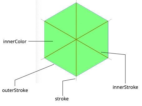
I want guidelines to be same color and width. Same goes for score lines but different colors and thicker than guides. For now, let all elements in the poles array be same as follows:

import React from 'react';
import { SafeAreaView } from 'react-native';
import { Hexagon } from '@digieggs/rn-polygon-chart';
const App = () => (
);
export default App;

Let’s add the other props, change the scores randomly and have a look at our final App.tsx file
import React from 'react';<br />
import { SafeAreaView } from 'react-native';<br />
import { Hexagon } from '@digieggs/rn-polygon-chart';<br />
const App = () => (<br />
<SafeAreaView><br />
<Hexagon<br />
innerColor="#00ff00"<br />
innerOpacity={0.5}<br />
outerStroke={{opacity: 1, stroke: '#0000ff', strokeWidth: 1}}<br />
poles={[<br />
{<br />
score: 0.4,<br />
innerStroke: {<br />
opacity: 1,<br />
stroke: '#ff0000',<br />
strokeWidth: 5,<br />
},<br />
stroke: {<br />
strokeWidth: 1,<br />
stroke: '#000000',<br />
opacity: 1,<br />
},<br />
},<br />
{<br />
score: 0.9,<br />
innerStroke: {<br />
opacity: 1,<br />
stroke: '#ff0000',<br />
strokeWidth: 5,<br />
},<br />
stroke: {<br />
strokeWidth: 1,<br />
stroke: '#000000',<br />
opacity: 1,<br />
},<br />
},<br />
{<br />
score: 0.6,<br />
innerStroke: {<br />
opacity: 1,<br />
stroke: '#ff0000',<br />
strokeWidth: 5,<br />
},<br />
stroke: {<br />
strokeWidth: 1,<br />
stroke: '#000000',<br />
opacity: 1,<br />
},<br />
},<br />
{<br />
score: 0.3,<br />
innerStroke: {<br />
opacity: 1,<br />
stroke: '#ff0000',<br />
strokeWidth: 5,<br />
},<br />
stroke: {<br />
strokeWidth: 1,<br />
stroke: '#000000',<br />
opacity: 1,<br />
},<br />
},<br />
{<br />
score: 0.7,<br />
innerStroke: {<br />
opacity: 1,<br />
stroke: '#ff0000',<br />
strokeWidth: 5,<br />
},<br />
stroke: {<br />
strokeWidth: 1,<br />
stroke: '#000000',<br />
opacity: 1,<br />
},<br />
},<br />
{<br />
score: 0.2,<br />
innerStroke: {<br />
opacity: 1,<br />
stroke: '#ff0000',<br />
strokeWidth: 5,<br />
},<br />
stroke: {<br />
strokeWidth: 1,<br />
stroke: '#000000',<br />
opacity: 1,<br />
},<br />
},<br />
]}<br />
/><br />
</SafeAreaView><br />
);<br />
export default App;

Since we set style by populating these properties, setting additional style (alignment, size etc.) property is up to you.

It is not over! Of course there is a bonus 😉

Our chart has animation option that will bring your app to another place. All you need to do is set animation prop of the polygon. For example:

<Hexagon
animation={{
delay: 0,
duration: 500,
easing: Easing.bounce,
}}
...
/>

You can find the package on npm and browse the code on GitHub.

Thank you for installing our components and reading this article. Feel free to comment and please open a GitHub issue if you have any problems.

Complete guide to using country code picker in your React Native projects

When it comes to getting the contact information of the user, one of the first entries that comes to mind is the phone number. Every country has a prefix for their phone number and asking the user to type it manually can cause some typos. To prevent it, we must use a drop down list that populated by these codes.

In this article, I will guide you to use npm package developed by DIGIEGGS, I also work at. You can also see the npm package and browse the code on Github.

1. Let’s create a clean React Native app with typescript template

You can skip to the step-2 if you already created a React Native app with typescript template.

Note: Unfortunately this component is not supported for Expo for now.

  • Open a terminal window
  • Navigate to folder you want to create your project at
  • Copy & paste the command below:

npx react-native init CountryCodePickerTest --template react-native-template-typescript

2. Installing the package

After creating your app, you can close the current terminal window. After that, you can follow two different ways to run our terminal commands which will affect our project. You can either

  • Open new terminal window and navigate to project’s root directory

or

  • Use the existing terminal provided by your IDE such as VSCode. (Doesn’t require navigating to root directory.)

After you choose the terminal you want to work on, let’s run the command below

npm install @digieggs/rn-country-code-picker

Before running your application, you must install two additional packages and pods for iOS.

  • Installing necessary packages:

npm install react-native-svg react-native-localize

  • Installing pods:

cd ios && pod install && cd ..

3. Let’s see our component in action

Now we are ready to run our application. Let’s run the following commands
npx react-native run-ios
npx react-native run-android

  • If you created a clean application to apply this article, you must be seeing a screen like this image:

To see our component clearly, let’s clear code in App.tsx file and start coding.

  • First, add necessary imports

import React from "react";
import { SafeAreaView } from "react-native";
import { CallingCodePicker } from "@digieggs/rn-country-code-picker";

  • Then, create a functional component and export it

import React from "react";
import { SafeAreaView } from "react-native";
import { CallingCodePicker } from "@digieggs/rn-country-code-picker";
const App = () => ;
export default App;

  • Finally, add the country picker component

import React from 'react';
import { SafeAreaView } from 'react-native';
import { CallingCodePicker } from '@digieggs/rn-country-code-picker';
const App = () => (
{}} />
);
export default App;

You can use the component as is but admit it… You want some styling 😉

Let’s do some styling

README.md file in Github repo has description about all props but let’s focus style props in this section. Our component is highly stylizable so we have eight seperate style properties.

Our component consists of two layers. Containers of these two layers have seperated style props because inner layer only wraps country flag and label but outer layer wraps them with modal. You can see them in image below:

Now let’s align it center screen. Our initial style object will be like this:

container: {
flex: 1,
justifyContent: 'center'
},
countryCodePicker: {
alignSelf: 'center'
}

We can change the togglerContainerStyle like this:

togglerContainerStyle: {
backgroundColor: '#BAFFC0',
borderRadius: 10,
padding: 5
}

Component also has a style prop for country code label called togglerLabelStyle. It is basically a text prop so we just change the font size for now.

togglerLabelStyle: {
fontSize: 20
}

So far, we worked on styles for toggler element. Now we will work on styles for list element.

We can change the container of list with listContainerStyle but I will leave it as is.

Another style is searchInputStyle. Let’s style our search input:

searchInputStyle: {
borderColor: '#888888',
borderWidth: 1,
height: 36,
borderRadius: 10,
paddingHorizontal: 10
}

And listStyle is simply FlatList style. That can be remain as is too.

Finally customize the list item with two different style props: pickerItemContainerStyle and pickerItemLabelStyle.

pickerItemLabelStyle: {
marginLeft: 10,
marginVertical: 10,
alignSelf: 'center'
},
pickerItemContainerStyle: {
width: '100%',
flexDirection: 'row',
justifyContent: 'flex-start',
alignSelf: 'center'
}

Let’s see the final component.

Our final App.tsx file is:

import React from 'react';
import { SafeAreaView, StyleSheet } from 'react-native';
import { CallingCodePicker } from '@digieggs/rn-country-code-picker';
const App = () => (
{}}
style={styles.countryCodePicker}
togglerContainerStyle={styles.togglerContainerStyle}
togglerLabelStyle={styles.togglerLabelStyle}
searchInputStyle={styles.searchInputStyle}
pickerItemLabelStyle={styles.pickerItemLabelStyle}
pickerItemContainerStyle={styles.pickerItemContainerStyle}
/>
);
export default App;
const styles = StyleSheet.create({
container: {flex: 1, justifyContent: 'center'},
countryCodePicker: {
alignSelf: 'center',
},
togglerContainerStyle: {
backgroundColor: '#baffc0',
borderRadius: 10,
padding: 5,
},
togglerLabelStyle: {
fontSize: 20,
},
searchInputStyle: {
borderColor: '#888888',
borderWidth: 1,
height: 36,
borderRadius: 10,
paddingHorizontal: 10,
},
pickerItemLabelStyle: {
marginLeft: 10,
marginVertical: 10,
alignSelf: 'center',
},
pickerItemContainerStyle: {
width: '100%',
flexDirection: 'row',
justifyContent: 'flex-start',
alignSelf: 'center',
},
});

Bonus!

I know you love bonuses and I just wanted to give you one.
You can provide an initial country code (with initialCountryCode prop) to show a default country when the component rendered first time. 😉

I hope you like our component. Feel free to comment and please open a Github issue if you have any problems.